Inconsistent brand
Logo, social, and site look different — customers do not recognize you.
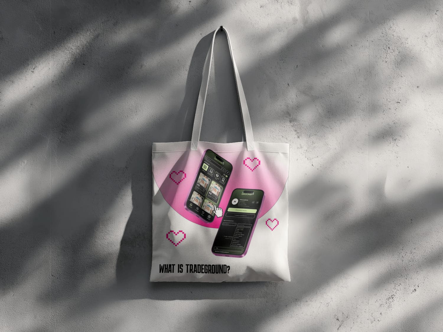
A logo and screens you can hand to a developer, not only drop into a deck. Figma, brand rules, page layouts. Two or three revision rounds inside the scope we agreed at the start.
Launch or rebrand and need a logo plus core visual system
Your site or app feels dated — you need modern UI/UX
You need Figma files that developers can ship faithfully
You publish across print and social — you need consistent colors and type
You have engineering — you need specs and components
Brand recognition must stay consistent across touchpoints
Design here is not decoration — it is brand language and path to conversion, handed off to development without loss.
Before
Logo, social, and site look different — customers do not recognize you.
Users get lost — leads and sales drop without an obvious reason.
Spacing, type, and button states lost between Figma and code.
Every new screen from scratch — slow and expensive.
After launch
Identity and UI work together — consistent across touchpoints.
Figma prototypes define the path to lead or purchase before coding.
Components and dev specs — fewer “eyeball” fixes after launch.
Design system speeds new pages and features in one style.
Logo, palette and screens in Figma — files a developer can build from, not only slides.


DETAILING
Mobile service • Before/after • Lead form

CLEANING
Standard • Deep Clean • ZIP quote • Mobile

TELEGRAM
400+ clients • +40% engagement • Order history

PSYCHOLOGY
Trust • Online booking • Expertise

CLINIC
Trust • Booking • Premium design

E-COMMERCE
Catalog • Online pay • Admin • Telegram alerts

REAL ESTATE
New builds • Investments • Areas • Mobile-first

AGENCY
Services • Cases • Packages • Leads

EDUCATION
Strong first screen • CTAs • Enrollment

E-COMMERCE
Catalog • Cabinet • Auto-delivery • Mobile

BILLIARD CLUB
Book a Table • Menu • 12-foot tables • Mobile

E-COMMERCE
WayForPay • Crypto • SEO • Meta Pixel

WEBSITE
Online pay • Locations map • PL/EN • Telegram alerts

EDUCATION
Trial lessons • Level test • SEO blog

FITNESS
Program pages • Breathing space • Sales 24/7

AUTO
Cases • Video reviews • Lead forms

SAAS
Filters • Alerts • Pricing

EDUCATION
Step-by-step test • Auto level • Responsive

FINTECH
Onboarding • Benefits • Cases • Consult

E-COMMERCE
Catalog • Lines • Promos • Checkout

LOGISTICS
Contact • Cost estimate • Mobile hero

EDUCATION
Expertise • Social proof • Book a consult

E-COMMERCE
Fast offers • Admin • Search • Favorites

AUTO
Catalog • Leads • International logistics

Logo, brand identity and UI/UX in Figma for websites and apps
Design signals trust before a single line of copy is read. Inconsistent visuals across channels quietly erodes confidence — we fix that with a structured process and deliverables you can reuse everywhere.
TeleBots covers design end-to-end: logos and brand systems, UI/UX for web and apps, and production-ready Figma kits. Our designer works across e-commerce, B2B, healthcare, education, and HoReCa.
Interfaces are planned for outcomes — hierarchy, color, and typography support conversion and recognition. You receive print- and web-ready assets, guidelines, and dev-ready mockups.
New marks or redesigns with multiple concepts and revision rounds. Palette, typography, patterns, and icons. Deliverables include AI, SVG, PNG (light/dark).
Rules for logo usage, color, type, spacing, and off-limits treatments. Templates for social posts and decks so partners stay on-brand.
Wireframes to full Figma UI for desktop and mobile, auto-layout, annotations, optional competitor scan and customer journey mapping.
Layouts that respect platform constraints on iOS and Android, componentized Figma libraries for faster build-out.
Posts, stories, covers, and highlights aligned to your brand system.
Business cards, flyers, banners, presentations — print-ready files (CMYK, 300 dpi, bleed).
Brief: async form or live call to capture goals and constraints
Analysis: market, competitors, and audience signals
Concepts: 2–3 directions to choose from
Refinement: iterative polish to the signed-off direction
Delivery: all agreed formats, brand guidelines, and Figma components
Figma for prototypes, UI kits, and auto-layout
Adobe Illustrator / Photoshop for logos and print
Components and tokens for predictable dev handoff
Alignment with existing brand manuals when provided
Exact pricing is confirmed after a free consultation and agreed scope; tier guidance is in the pricing table below on this page.
AI/SVG/PNG/PDF for identity work; Figma projects with structured components for UI/UX engagements.
Yes — browse the portfolio section on this site for branding and interface case studies.
Depends on rounds and touchpoints; we align timelines after the brief. Tier guidance sits in the pricing table below.
Yes — we modernize marks for digital use, refresh typography and palettes, and export updated asset packs.
Yes — compact packages for logo, base system, and UI for a landing page or app screen set, expandable after validation.
Logo and brand identity: mark, colors, fonts, applications
Business cards, letterhead, envelopes, social media kit
UI/UX for websites and mobile apps
Figma prototypes and mockups with dev handoff
Brand books and style guides for consistency
Responsive layouts for different screens
Payment: 50% before start, 50% after approval of deliverables
Timeline: logo 3–7 days, brand 1–2 weeks, UI/UX by scope
2–3 revision rounds within scope included
Files in required formats (PNG, SVG, PDF, Figma)
Option to continue with us for development from your mockups
Figma — main tool for mockups and prototypes
Export for development and print
Handoff of styles and components to code when needed
Alignment with your brand guide or existing assets

Logo, brand identity and UI/UX for websites and apps
150-300
Logo and basic identity: main mark, colors, font. Files for print and web.
300-600
Full brand identity: logo, business cards, letterhead, socials. Brand book or style guide.
500+
Interface design: Figma prototypes, website or app mockups, responsive, handoff to development.
Need a full-scope project? to discuss
Briefly describe the task — we’ll propose a scenario, timeline, and ballpark price.
Get a clear commercial proposal
Kyiv, Ukraine
Standard carrier rates may apply
